It’s Garry Shandling’s Book
Edited by Judd Apatow
Random House

THIS document of the life of comedian Garry Shandling combines elements of history, personal stories and scrapbook. The design had to make room for the diverse content and numerous voices in a chronological, visual format. For all books, but especially visually dense titles, we try to keep in mind the idea of points of entry. I think this book has them in abundance, helping slow readers down long enough to consider reading more verbose content or convincing them to browse a bit longer.
Skeuomorphism is a technique that comes up a lot in coffee-table books, in this case by scaling diary pages and documents to life-size in order to give readers a more solid connection to Shandling and his world. The quality of the material and collaborating with Judd Apatow and his skilled team, as well as working for the first time with the experienced people at Random House makes this one of my favorite coffee-table books to date.
My Heart vs. the Real World
By Max S. Gerber
Cold Spring Harbor Laboratory Press

BELIEVE this was the first or second coffee-table book we designed here at designSimple. It was for Max Gerber, one of the most unique and talented portraitists I’ve known, and like many of my other favorite coffee-table books, it stands out for its deeply personal content.
The genesis of this project began with Max’s relationship with Camp del Corazon, a camp for children with heart disease. Max himself had a congenital heart defect and has had a pacemaker implanted since he was a small child. As such, he became an example to, and documentarian of the young survivors at this very special camp. Originally some of the content ran as a cover package in LA Weekly, and I had the honor of being Max’s editor. Years later when Max and Cold Spring Harbor Press were committed to publishing a large hardback, I was called.
This book embodies one of my driving philosophies as a designer: Don’t put yourself between the content and the reader.
Predicting the Past
Zohar Studios: The Lost Years
By Stephen Berkman
Hat & Beard Press

STEPHEN Berkman is a mischievous genius. It was a fortunate day for us when this project — sort of Berkman’s first-half life’s work — landed on our table thanks to a recommendation by amazing designers Coco Shinomiya and Sean Tejaratchi, both of whom created pages and prototypes for Berkman before designSimple got involved.
Memorable for us is that we worked with the author to produce this book in about two month’s time, over the winter holidays, while I had to travel. If you aren’t a book designer, that’s a crazy fast pace for a book of this length and complexity. We spent days just getting the footnote formatting perfect.
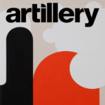
This book, at over 11″ x 14″ and almost 2″ thick, is the largest (by weight and volume!) book we’ve designed to date. It is also an impressive bit of press work. The front images were produced as tri-tones, the paper quality was extraordinary, all done by Trifolio in Verona, Italy. I’m wearing a blue suit and sipping a cappuccino with my legs crossed as I type this. For more details from the author himself, here’s a link to an interview for Artillery Magazine.
Home Sweet Road
By Johnnyswim
Convergent

POPULAR musicians Johnnyswim (Amanda Sudano and Abner Ramirez) are used to being on the road performing for fans, but they were sidelined during the pandemic. Stuck at home, they kept busy doing virtual events and (this is where we come in) making a book! Fortunately, Johnnyswim had been thinking about books for a while and were well prepared.
This stood out among the books about artists that we’ve designed, in that it incorporated personal recipes and conveyed a sense of family and home that seemed down to earth. We tried to make that come through in the layouts, while at the same time not letting you forget that these folks make a living on the road performing to sell-out crowds around the country.
Assistance League of Los Angeles: The First 100 Years
By Tanja Laden
Asisstance League of Los Angeles

KNEW very little about the long and storied history of the L.A. chapter of Assistance League before being brought into this project by old friend, filmmaker, and publisher Jodi Wille. Coffee-table books are history books, and I love history, especially the stories I haven’t yet heard. To tell this history, we tried to use a nostalgic palette and also a layout grid that loosely evoked a mid-20th Century feel which I thought was connective, a gateway between early and modern graphic design, symbolic of ALLA’s service and evolution over ten decades.
Inspiration came from books, magazines and typographers of that design era, as well as from the large cache of photographs and documents from ALLA’s archives. The wide format was practical and symbolic. Much of the artwork we wanted to run large was horizontal, and also the horizontal aspect, to me, suggests landscape and history. Horizontal pages accelerate you left to right and, in a subconscious way, emphasizes the passage of time.
Sylvia Kristel, from Emmanuel to Chabrol
By Jeremy Richey
Cult Epics

THIS is the most expansive and luxurious survey of the work of Dutch film icon Sylvia Kristel ever printed. It’s sold as a standalone hardback and also a limited-edition box set which includes a poster and DVDs in a compartment beneath the book.
If you are a fan of Kristel or her films, grab this book. Cult Epics really outdid themselves for the fans, the price for the quality is a steal, especially for the box set. And because of the press runaround during the pandemic, fewer copies were printed than originally planned. That’s insider info. XD More of the book’s interior in spotlightOn: Arts »
The Cockettes, Acid Drag & Sexual Anarchy
By Fayette Hauser
Feral House

MET author Fayette Hauser through unfortunate circumstances. Her editor, my friend and client, and legendary founder of Feral House books, Adam Parfrey had died earlier that year. Not many months later, we were asked by head of Feral House, Jessica Parfrey, to take on the Cockettes project which was nowhere near ready for publication, yet had a semi-hard deadline approaching. The visual history of the Cockettes would have been an ambitious book for a veteran author. This was Fayette’s first book. Plus she was serving as photo editor and creative director.
Over the next few months, Fayette and I met for coffee and long meetings where we poured over images, new articles, layout tests… it was exhausting but rewarding. The end result is a true treasure of cultural history and a loving chronicle and homage to a group of people whom many have not heard of, but who have had an impact on mainstream tastes and entertainment.
Compliments of Chicagohoodz, Chicago Street Gang Art & Culture
By Jinx & Mr. C
Feral House

Christian Death, Only Theatre of Pain
By Edward Colver
Cult Epics

THIS set includes hardback, LP and poster, all held together in a heavy printed slipcase. The LP production was done by Frontier Records and is a faithful recreation of one of Christian Death’s more famous albums. The look of parts of the book was heavily influenced by deceased Christian Death founder and frontman, Rozz William‘s, own designs, including the logotype and artwork on the endpapers. Nearly every photograph in the book was taken by Edward Colver, who followed the group through their run.
All content was designed on black pages at the request of the publisher which lead us to choose a type spec that was a little larger than we would normally use. The pages, though mostly black and white, were done in four color with rich blacks, and I was concerned about the press being able to hold registration on small white body text. In the end the press printed and bound the book beautifully and, like many Cult Epics titles, this book has become a definitive record of its subject.
American Hair Metal
By Steven Blush
Feral House

STEVEN Blush’s first book, American Hardcore, covered the at-the-time overlooked punk music scene of the early ’80s. Hair Metal was his follow-up work of roughly the same era and, some would say, antithetical. It’s a listing of the bigger hair metal acts of the time. Much of the book’s personality relies on the amazing band photos, the outlandish and unintentionally ironic quotes, and predictably ridiculous lyrics which we set as pull quotes throughout the sections.
The design took inspiration from the ’80s in general and magazines such as Hit Parader and Circus. I admit that this was not a hard one for me as I grew up reading these magazines and listening to this wonderfully vapid music. One of my favorite details was the can of Aqua Net that I photographed to go on the end paper. The idea was the brilliant suggestion of editor Jodi Wille. To top it off, we designed an appropriate logo for the title. I’m still waiting for my T-shirt.
Update: We are in the process of designing the reissue of this classic. New cover, some new sections, intro by Chip Z’nuff… should be nothin’ but a good time. 🙂