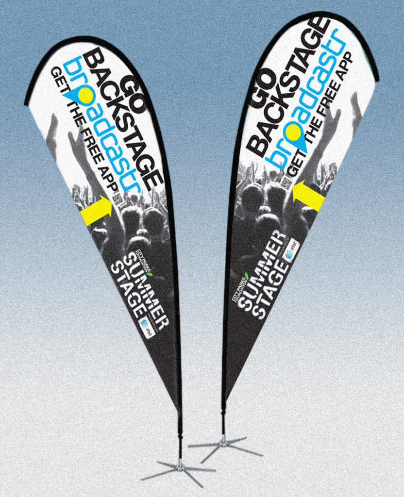
I remember the first pieces I ever worked on that were meant to show in public spaces. Nothing fancy, but because I worked at newspapers, I’ve done a lot of rack cards and similar marketing signage. Along with those came event banners, posters, booths and billboards, even a window display at the old Rhino Records store.
I was initially torn about the billboards. In general I think they’re a blight, but I was also kind of eager to try to work in such a large space. Ego trumps ethics. One of my first billboards, though, was a subversive jab at the medium, I made the whole billboard (pic below) a photo of blue sky and clouds. There was, of course, a giant logo in there (or I would’ve been fired) but most of the 20’x80′ area was blue sky.
Many years later we have done a fair number of environmental graphics, many for overseas political campaigns. I still don’t think of us as experts, but we try to bring our best effort to these projects always. —Bill
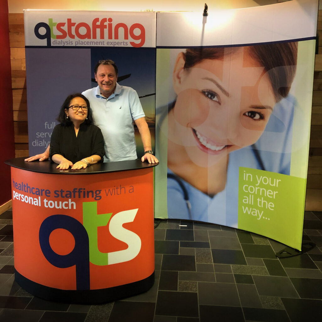
QUIK TRAVEL [sic] Staffing, aka QT Staffing and QTS, is a travel nursing management company. We’ve done work for them including corporate identity, branding and some web. Here’s a booth we designed, using a pre-made convention booth. So we designed the skin over the foldable frame. We’ve done booths before, but I like this one because it’s so curvy.
ALL of the billboards we’ve done in recent years have been for political campaigns mostly abroad, but here are some fun ones from many years ago. Actually three of the earliest billboards I ever created, all for LA Weekly.
» The first was a subversive piece expressing my general disdain for billboards, the main art being clouds. I was trying to make the billboard disappear into the LA sky. But, of course, clouds are a rarity in Los Angeles, and the sky is often less blue and more hazy yellow. I know this, but it was an optimistic interpretation. This billboard was part of a larger campaign that I called “Free Thinking” which ends up being a triple entendre, I think, for the free weekly paper.
» The second billboard was for the Democratic National Convention, held in LA that year. This was part of a larger campaign I made for a series of special issues of the newspaper, doing daily coverage of the DNC. I’m still happy and a bit surprised that they let me get away with the overt Communist symbolism.
» And the third was for a special issue, the campaign revolving around a time traveling character who represented the issue’s temporal theme at the turn of the millennium.